Or: about User Interfaces and loss of useability

Background
When we started using computer programs, complete educational programs were established to convey the knowledge of using FORTRAN, COBOL etc. In these trainings both the functionalities for the user and how to realize these results (the User Interface or UI) were covered. Once moving to simplified applications for the masses like Word, Wordperfect etc. the trainings on these programs became separate and profitable business lines. There are people who would argue that the profits on trainings were one reason for Microsoft to change their User Interface with every upgrade. (And some that this opened the door wide for Apple.)
Apple, on the other hand, had a totally opposite strategy: make the Graphical User Interface so intuitive (with the help of those graphics) that no training was ever necessary. Whereas that might have been true initially, with the expansion of functionalities it meant that they ran out of obvious unambiguous graphics. True afficionado’s would have acquired significant experience in other Apple tools to find the supposedly intuitive functions whereas new converts would be punished for not having submitted to the Apple-religion earlier. The Apple Graphical User Interface works because for one it is well-designed, but also because it assumes full immersion into the system. Those ‘hanging in between’ Apple and Android are left with managing multiple User Interfaces, and sometimes bewilderment.
Modern times
So far the strategies of big, market dominant players. Many new (small) software providers do not have the market presence to be able and ‘extract a training fee.’ So, in a market where also the rise of Apple and the supremacy of their intuitive GUI has given many of them the legitimacy to claim that their GUII is also supposedly ‘intuitive’. In practice most are not – and the multitude of different GUI’s defeats the purpose – but it saves them time and effort to spend on educating the masses on the use of their application. Of course, these applications can not become successful if users in general do not fully grasp the functionalities. However, if we look at the distribution of videoconferencing applications as an example, we can observe that these are driven by a core group of ‘evangelists’ who use the application often (or like an IT-Department, prescribe their usage) , where most of the users reluctantly are being standardized in that usage. Those that are forced to use multiple of these systems (e.g. Skype for their internal company usage, Microsoft Teams for one client, Google for another and Zoom for the charity board) are not only confronted with different technical requirements, exclusions because of safety precautions but most importantly with different GUI’s leading to the recurring question: “I know I can do this functionality somewhere, but where do I find it again?”
Similar but less contentious to ‘Information bubbles‘, these User Interfaces lead to segregation into user groups. A couple of decades ago fairly innocuous User Interfaces like faucets haunted international travelers with old showers that did not respond fast to changes in temperature (do they turn to the left or to the right for warm? or forward or backward? And, by the way, do we measure that on the top or at the bottom of the circle?) Fortunately, now there is an easy trick to find out for modern showers: quickly turn in both directions and in one direction you will find a block. That is the 37 degrees Celsius block from cold to hot. Problem solved.
The User Interface is gradually becoming ever more important: only hovering over a link will automatically activate it, a video pushed to your timeline will automatically start playing, and also ever more annoying: in some timelines – e.g. Twitter and Linked In – content will jump on the page because a new ad needs to be ‘pushed in’ so that the content you wanted to click on suddenly disappears. Oh, and navigating via the bar on the right hand side gets you into a rollercoaster of inputs without too much control. Most of these ‘improvements’ seem to come from the need of the pure evangelist user – and the interest of the software provider to control the attention span and nudge the user. The ‘average Joe’ user is – due to a lack of alternatives and ‘voice’ – forced to comply, which is exemplified in one simple use case: How does an Android user learn how to make a screenshot with an Iphone? Or the other way around.
So far, these effects are just part of the mechanics of the capitalist market, nothing morally abject to it, maybe just frustrating to people insisting on their independence of a technology provider and freedom. Now here might be a (common use?) opening for a product catering to this group, a technological equivalent of the solution to the ‘faucet dilemma’ mentioned earlier.
Proposed solution
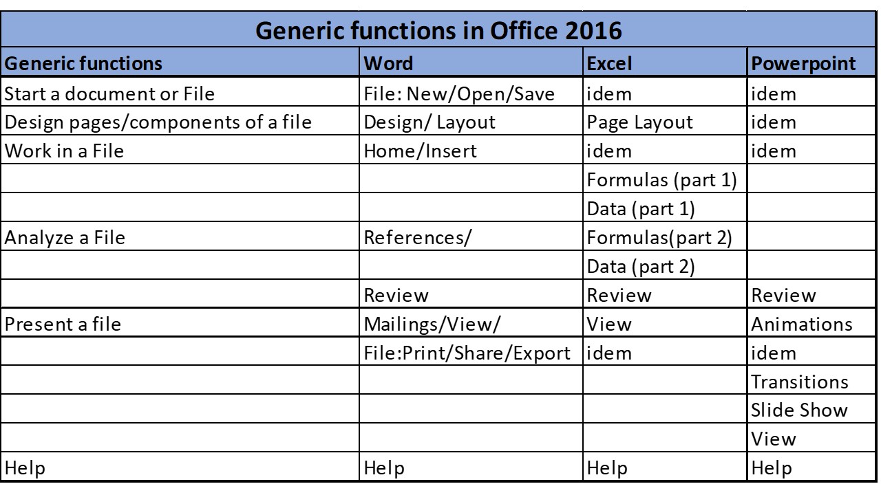
Therefore, I propose a standard for a back-up menu: a typical way of arranging features so that the uninitiated can easily find the feature of choice, not only with the ‘how to’ but also the ‘where to find it’. Below a sample based on some Microsoft 2016 applications, probably the most widely known basis. Any other basis would do as well., as long as it has been standardized. Only top-level has been worked out here, to show the principle. Wouldn’t a world where all Microsoft, Apple, UNIX, SAP, Oracle and other applications have a similar menu structure be a great achievement?